Cart
0
Introduction:
Ever walk into a room that feels somehow "off" even though everything matches perfectly? Or visit a space that immediately feels warm, interesting, and inviting? The difference often comes down to one design principle: layering. Layering is what transforms a room from looking staged or sterile into feeling lived-in and loved. It's the secret to creating visual depth, adding personality, and making spaces feel complete. Here's how to master this essential technique.
Body Content:
Understanding Layering in Design
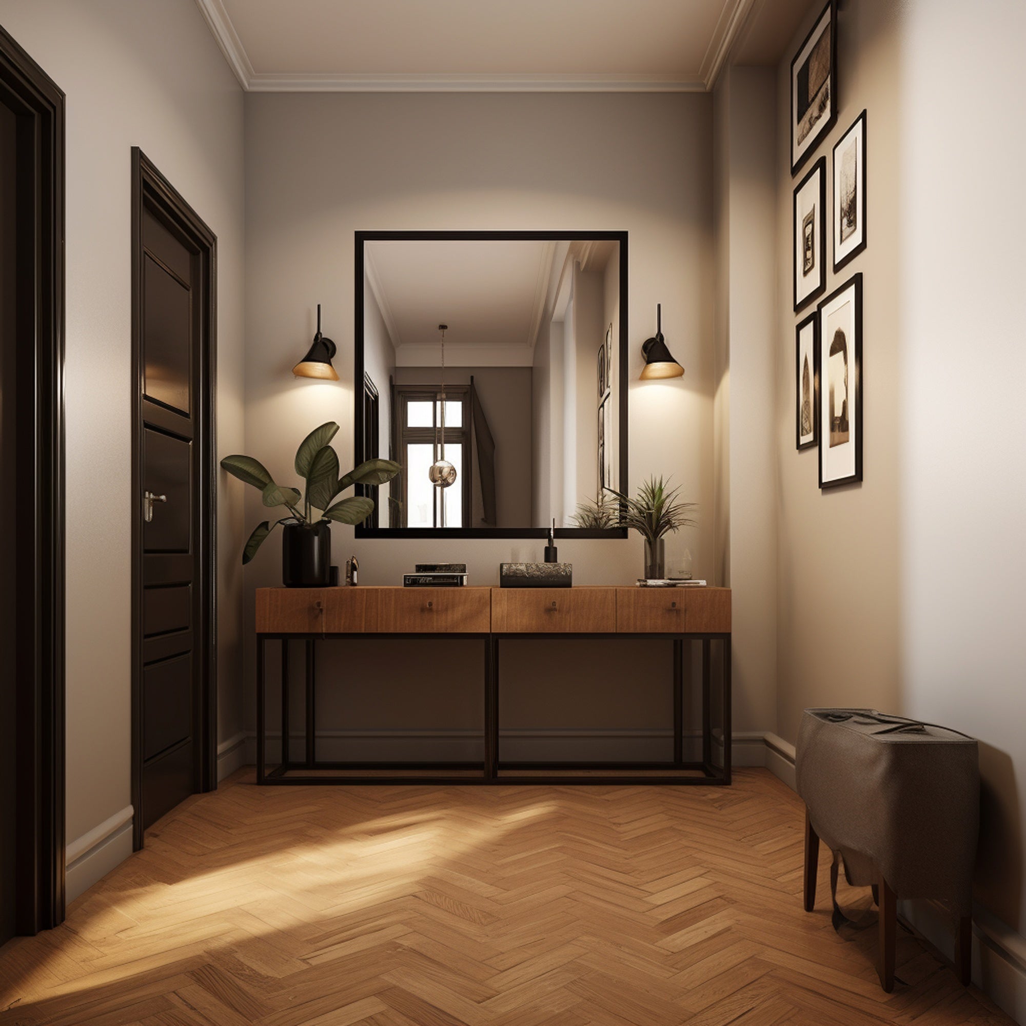
Layering means building up multiple elements—textures, patterns, colors, heights, and objects—to create visual richness and depth. Instead of placing a single item on a surface or one piece of art on a wall, you combine multiple elements that work together while maintaining distinct identities. The result is a room that rewards the eye with discovery, feels curated rather than purchased all at once, and has genuine character.
Think of it like dressing. A single-layer outfit (just a dress or just pants and a shirt) is functional but simple. Layer on a jacket, scarf, jewelry, and the right shoes, and you've created visual interest. Rooms work the same way.
Layering Textures: The Foundation
Texture layering is perhaps the most critical and most overlooked aspect of room design. A room with varied textures feels rich and inviting even with minimal color. A room with only one texture feels flat no matter how expensive the pieces.
Mix Materials Deliberately
Combine smooth with rough, soft with hard, matte with shiny:
- Smooth: Glass, polished metal, satin fabrics, glossy finishes
- Rough: Natural wood, stone, jute rugs, raw linen
- Soft: Velvet, wool, faux fur, knit throws
- Hard: Metal fixtures, ceramic vases, wooden furniture
A living room might include: a linen sofa (soft), wooden coffee table (rough), metal lamp (smooth and shiny), wool throw (soft), ceramic vases (smooth), and a jute rug (rough). Each texture stands out because it contrasts with others.
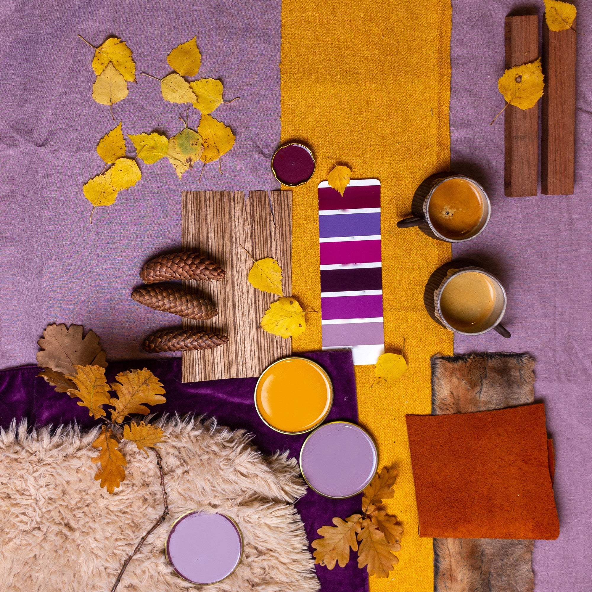
Layering Colors and Patterns
Color layering creates visual flow and prevents rooms from feeling one-note or chaotic.
Start With a Base
Choose a dominant neutral (white, beige, gray, or even a muted color like sage or navy) for large surfaces—walls, large furniture, rugs. This provides a calm foundation.
Add Secondary Colors
Introduce 2-3 complementary colors through medium elements like throw pillows, curtains, smaller furniture pieces. These colors should appear multiple times throughout the space to create cohesion.
Accent With Intention
Add small pops of a bolder color or metallics through accessories—vases, candles, small decorative objects. These don't need to appear everywhere; they're surprise elements that catch the eye.
Pattern Layering
Mix patterns of different scales: pair large patterns (like a big floral or geometric) with medium patterns (stripes or smaller prints) and small patterns (tiny dots or textures). Keep them in a complementary color family to maintain cohesion. The general rule: no more than three patterns in one space unless they're all very subtle.
Layering Objects: The Styling Secret
This is where rooms go from "decorated" to "designed."
Height Variation
Never place items at the same height. On a coffee table, stack books flat, place a tall vase beside them, add a small low bowl. The varying heights create visual rhythm. On shelves, mix tall items with short, leaning frames with straight-standing objects.
The Rule of Three (and Odd Numbers)
Objects arranged in groups of three or other odd numbers feel more dynamic and natural than even-numbered groups. Place three candles of varying heights together, cluster three small vases, or style a shelf with groups of three-ish items (three books, one decorative object, three small items grouped together).
Overlap and Lean
Don't be afraid to overlap objects slightly or lean artwork against walls rather than hanging everything. This creates depth and a collected-over-time feeling rather than everything-bought-in-one-trip energy.
Foreground, Middle Ground, Background
When styling surfaces, think in three dimensional planes. Place small items in front, medium items in the middle, and taller items in back. This creates depth even on flat surfaces.
Layering Wall Decor
Walls are prime real estate for layering.
Gallery Walls
Mix frame styles, sizes, and subjects. Include different types of art (prints, photographs, small mirrors, decorative objects). The variety creates visual interest while the grouping creates cohesion.
Shelf Styling
On open shelving, layer items in front of each other slightly. Lean artwork against the back wall with decorative objects in front. Stack books horizontally and vertically. Mix practical items with purely decorative ones.
Layering Window Treatments
Instead of just blinds or just curtains, layer them. Add sheer curtains under heavier drapes, or pair blinds with a valance. This adds depth to windows and allows more control over light and privacy.
Common Layering Mistakes
Too Matchy-Matchy: When everything coordinates perfectly, nothing stands out. Rooms feel like they came from a catalog. Instead, aim for pieces that complement without matching exactly.
All One Texture: Leather sofa, leather ottoman, leather chairs—too much of even a good texture feels monotonous.
Cluttered vs. Layered: Layering has intention and breathing room. Clutter is just too much stuff. Each layer should be deliberate; if you can't explain why something is there, remove it.
Ignoring Negative Space: Layering doesn't mean filling every surface. Leave breathing room between groups of objects and empty spaces on walls.
Conclusion:
Mastering layering takes practice and a willingness to experiment. Start small—layer one surface well, then move to another. Take photos to see your space with fresh eyes (cameras reveal what our adjusted vision misses). The goal isn't perfection; it's creating spaces with depth, personality, and the kind of visual interest that makes you actually want to spend time there.