Cart
0
Introduction:
Color isn't just aesthetic—it's psychological. The colors surrounding you influence your mood, energy levels, and even how you interact with others in a space. This isn't mysticism; it's neuroscience. Our brains respond to color in measurable ways, affecting everything from productivity to relaxation to appetite. Understanding color psychology allows you to design rooms that support their function and your wellbeing. Here's how to choose colors intentionally.
Body Content:
How Color Affects Us
Colors influence us through both cultural associations (learned meanings) and biological responses (innate reactions). While cultural meanings vary, many biological responses are universal. Cool colors (blues, greens) typically calm us by lowering blood pressure and heart rate. Warm colors (reds, oranges, yellows) energize us by increasing adrenaline and alertness.
The intensity matters as much as the hue. Soft sage green affects you differently than neon lime, though both are "green." Generally, muted tones create calm, while saturated tones create energy.
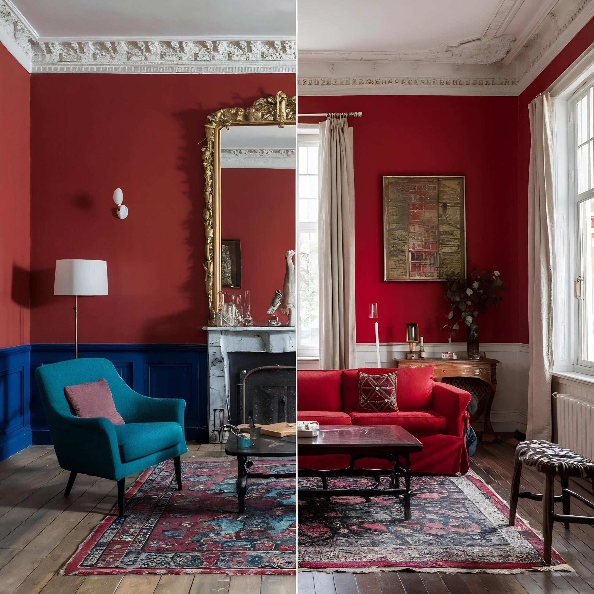
Red: Energy, Passion, and Appetite
Red increases heart rate and blood pressure, creating feelings of excitement, urgency, or passion. It's stimulating—sometimes too much so. Red can make people feel energized but also stressed or aggressive if overused.
Best Uses: Dining rooms (red stimulates appetite and conversation), accent walls in social spaces, small doses in home offices (for motivation), entryways (creates energetic welcome).
Avoid: Bedrooms (too stimulating for sleep), large quantities in spaces where you need calm, children's rooms (can increase hyperactivity).
Design Tip: Use red in accessories (pillows, art, small decor) rather than walls unless you want a truly bold statement.
Blue: Calm, Focus, and Serenity
Blue lowers heart rate and blood pressure, creating feelings of calm, trust, and stability. It's consistently rated as people's favorite color. Blue can improve focus and productivity (which is why many office buildings use it) and promote restful sleep.
Best Uses: Bedrooms (promotes sleep), bathrooms (creates spa-like calm), home offices (aids concentration), any space where relaxation is the goal.
Avoid: Dining rooms (blue is appetite-suppressant; food rarely appears naturally blue, so our brains find it unappetizing), kitchens, or spaces that need energy.
Design Tip: Deeper blues (navy, indigo) feel more sophisticated and grounding; lighter blues (sky, powder) feel more airy and tranquil.
Green: Balance, Nature, and Renewal
Green is the most restful color for eyes (due to its position in the light spectrum) and is strongly associated with nature, creating feelings of balance, harmony, and renewal. It combines the calm of blue with the energy of yellow, providing gentle refreshment without sedation or overstimulation.
Best Uses: Literally anywhere. Green is uniquely versatile—bedrooms, living rooms, kitchens, offices, bathrooms. It's especially good in spaces where you want balanced energy.
Avoid: There's no space where green doesn't work; it's more about choosing the right shade. Avoid colors you personally dislike regardless of psychology.
Design Tip: Sage, moss, and forest greens feel organic and calming; emerald and kelly greens feel more vibrant; mint and seafoam feel fresh and light.
Yellow: Optimism, Energy, and Cheer
Yellow is the brightest color we can see and is strongly associated with sunshine, creating feelings of happiness, optimism, and mental stimulation. It can boost mood and encourage communication. However, overly bright or too much yellow can cause anxiety or irritability.
Best Uses: Kitchens (creates cheerful energy), breakfast nooks, home offices (sparks creativity), children's playrooms, spaces that lack natural light.
Avoid: Bedrooms (can be too stimulating), large quantities in small spaces (can feel overwhelming), nurseries (studies suggest yellow rooms make babies cry more).
Design Tip: Use muted yellows (butter, cream, gold) for sophistication; save bright yellows for small accents.
Orange: Warmth, Creativity, and Sociability
Orange combines red's energy with yellow's happiness, creating feelings of enthusiasm, creativity, and warmth. It's friendly and inviting, encouraging social interaction and physical activity.
Best Uses: Living rooms and gathering spaces (promotes conversation), creative workspaces (stimulates imagination), exercise areas (provides motivation), kitchens (warm and inviting).
Avoid: Bedrooms (too energizing), meditation spaces, formal areas.
Design Tip: Terracotta, rust, and burnt orange feel grounded and sophisticated; bright orange works best in small doses.
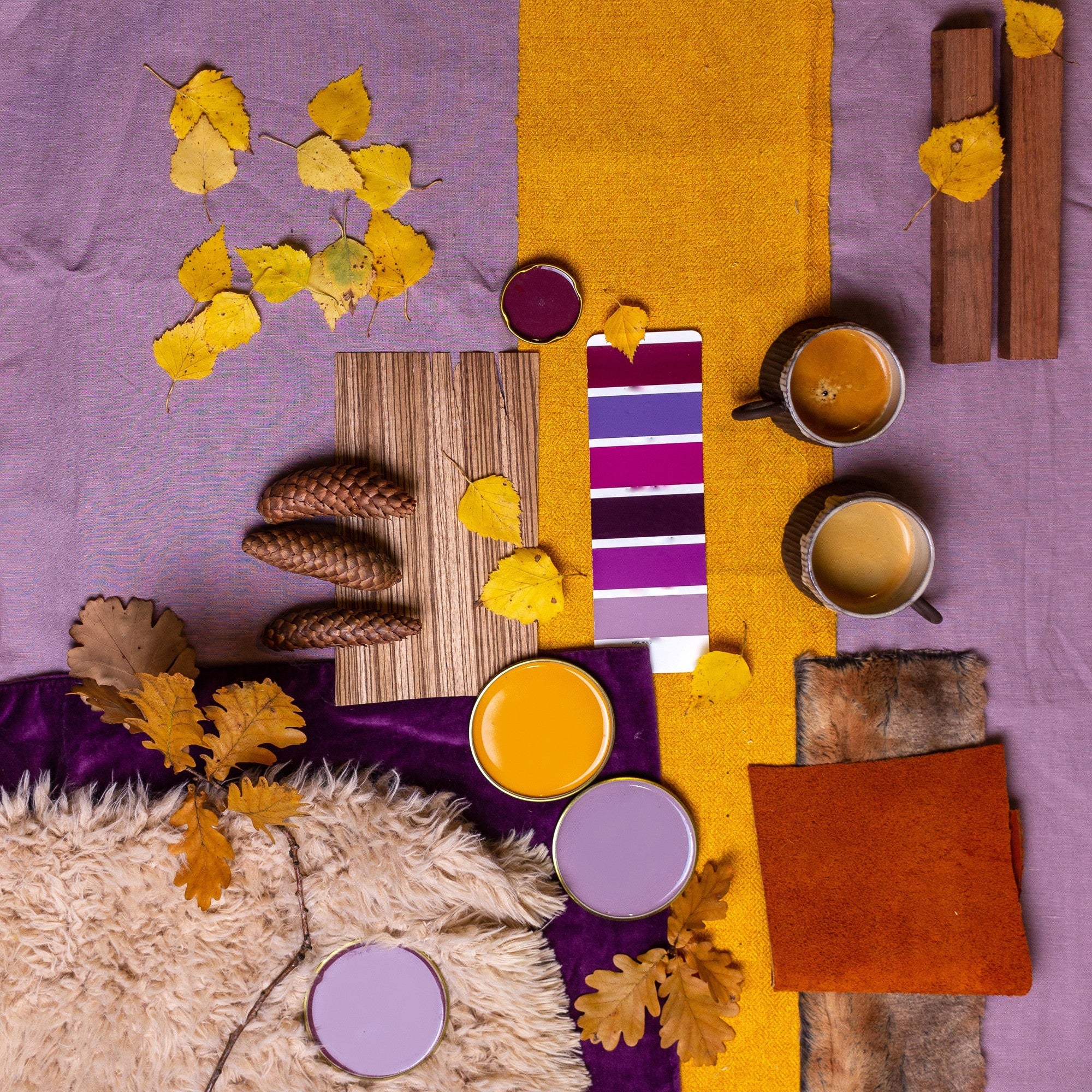
Purple: Luxury, Creativity, and Spirituality
Purple has historically been associated with royalty (due to dye rarity) and creates feelings of luxury, wisdom, and creativity. Lighter purples (lavender, lilac) are calming; deeper purples (eggplant, plum) are dramatic and sophisticated.
Best Uses: Bedrooms (especially lavender for sleep), creative spaces, reading nooks, any space where you want luxury feel.
Avoid: Kitchens (uncommon in food, can suppress appetite), bathrooms (can feel too heavy), small spaces in dark shades.
Design Tip: Use purple in fabrics and accessories rather than walls unless you want dramatic impact.
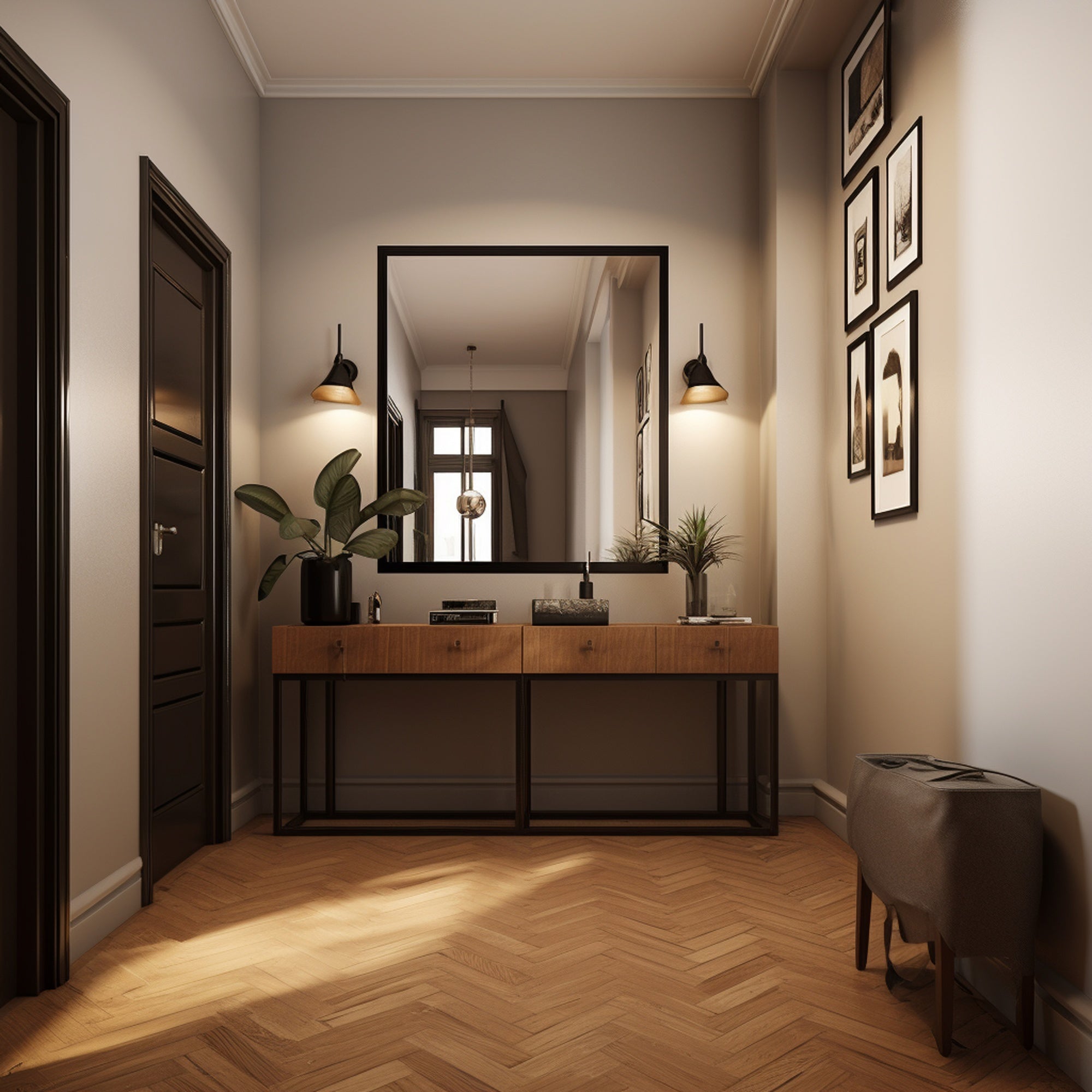
Neutrals: Versatility and Timelessness
Whites, grays, beiges, and browns don't directly influence mood but create blank canvases that take on the mood of accent colors. They provide visual rest and make spaces feel larger, cleaner, and more sophisticated.
Best Uses: Everywhere, especially as base colors. They allow flexibility as your mood or accent colors change.
Design Tip: Layer multiple shades of the same neutral family (three shades of gray, for example) to add depth without color commitment.
Creating Palettes by Room Function
Bedrooms: Blues, soft greens, lavenders, muted grays—anything that lowers heart rate and promotes calm.
Living Rooms: Warmer neutrals, soft greens, warm grays—colors that feel welcoming but not overstimulating.
Dining Rooms: Warm colors (reds, oranges, warm yellows) that stimulate appetite and conversation.
Home Offices: Blues and greens for focus; small touches of yellow for creativity.
Bathrooms: Blues and greens for spa-like calm; whites and grays for clean, fresh feel.
Conclusion:
Color psychology isn't prescriptive—you won't ruin your sleep with the wrong bedroom color. But understanding how colors influence you allows you to design intentionally. Consider how you want to feel in each space, choose colors that support that feeling, and adjust based on your personal reactions. The goal is creating environments that enhance your life, and color is one of the most powerful tools you have.
CTA: Ready to find the perfect colors for your space? Browse our collections organized by room and style.